Shelter / Industry

|

|
14" x 18" (x2)
Gouache paint
November 2023
Gouache paint
November 2023
This project is a double piece artwork based on sex work under capitalism. These pieces had 3 inspirations; Seated Nude by George Braque, Floyd Dell' Opera by Jean Louis Forain, and Henri De Toulouse-Lautrec's poster work, made with gouache paint on a canvas board. The first depicts sex workers standing with a man in black, staring at the camera. The second a women, naked and covered by a blanket. Her back is to the camera, and skin is full of bruises, from her back to her wrists.
Inspiration

Seated Nude by by George Braque (1906)
|

Moulin Rouge by Henri de Toulouse-Lautrec (1892-1895)
|

Floyd Dell' Opera by Jean Louis Forain (1900)
|
 Image of Floyd Dell' Opera by Jean Louis Forain (1900) from the Milwaukee Art Museum
This project had three inspirations, two direct ones and one non-direct one through Henri de Toulouse-Lautrec's art style. A month ago, I visited the Milwaukee Art Museum in my city. There, I saw Seated Nude and Floyd Dell' Opera in the exhibits and really loved the pieces. Both are very similar in style, utilizing hues over form, both artists having a history with more color based art movements, Braque having a past with being a mainstay in the fauvism movement, and Forain being an impressionist painter. Seated Nude depicts a naked woman sitting on a red chair with white fabric wrapped around her body. Floyd Dell' Opera depicts a group of ballerinas outside of a blue building, multiple other women in the background, surrounding themselves around a man in a black suit. I've always been attracted to visually striking artwork, and both of these undeniably are. I adore the soft colors and shading in Seated Nude that clashes with the bright red chair the woman is sitting on, giving the painting a wonderful juxtaposition between the object and person in the piece. Floyd Dell' Opera evokes much of the same emotions; I love the sharp warm and cool hues in the piece that create a striking contrast in the work. As for Henri de Toulouse-Lautrec, I've always admired his artwork, and especially his poster work. I love the distinct colors and style in his posters, and have planned to use it as an inspiration piece since the beginning.
|
Jean Louis Forain often painted for a number of reasons; this piece was based around his love for the opera and entertainment, however later in his life, his paintings evolved to be religiously and politically centered. In the bibliographical article Jean Louis Forain, it states, "Degas introduced Forain to the world of opera which became one of his favorite topics, with its dancers and abonné, well-heeled French men who paid a subscription to be allowed behind the scenes." (Jean-Louis Forain (1852-1931), Jean-LouisForian.com) Georges Braque was nearly opposite for his reason for painting; he created artwork because of his love for the craft, instead of his love for the things he painted. We see this throughout his career; he was extremely fluid with his art, hopping from movement to movement throughout his life. This particular piece is a fauvism piece, the Britannica bibliography stating that he was a "rather prudent and traditional minded fauvist," (McMullen, Georges Braque) but later in his life he ended up switching art movements to the Cubism movement. This was the biggest shift, but even before that he had changed movements multiple times. Finally, Henri de Toulouse-Lautrec was often inspired by his environment, painting scenes from local bars, theaters, and sex workers around the city. "The posters were made in large numbers and intended to appeal (as advertisements) to a mass audience, whereas the artist’s fine-art prints were created in small editions, on more refined paper, for an elite group of connoisseurs." Stated the authors at Christie's in the article The posters and lithographs of Henri de Toulouse-Lautrec. His poster work was extremely influential, even in his time, art critic Gustave Coquiot having stated, "He made people uncomfortable, but they also shivered with pleasure." While arguably his most famous poster was commissioned by the Moulin Rouge, he would go on to promote many other businesses through his art like bicycle chain stores and French Dancers. While all three of these artists are extremely different in their works, they have many through lines between those differences, ones that I wanted to shift and connect together through my work.
|

Image of Seated Nude by by George Braque (1906) from the Milwaukee Art Museum
|
 Poster for "La Châine Simpson" Bicycle Chains by Henri de Toulouse-Lautrec (1896)
When creating this piece, I had many reasons for choosing these paintings as inspiration. Even though these seemingly have no connection, it was important to me that I chose one of the paintings to be nude. I don't want to demonize sexuality or sex work with this piece; I want to critique the sex industry and how it perpetrates violence against women and how it thrives under capitalism, how it portrays inaccurate ideals of femininity for a male centered audience. So I wanted to find reference pieces that are near opposite in how it portrays women in their pieces. This is no hit to Forain's work, no critique of his portrayal of women, but how he drew them were completely opposite to Braque's painting. The women in Opera are small and dainty, thin and in perfect shape according to eurocentric beauty standards. While there are women who look like this, I would say that Nude portrays a more "realistic" version of the female body. This is, of course, helped that it's a nude painting and close up, but either way it's the complete opposite to Opera. Compared to the thin figures in Opera, Seated Nude depicts a woman with more accurate proportions, with rolls and dents in her body. This contrast was a big reason why I chose the two paintings, and I think they add more to the themes of the piece. Floyd Dell Opera caught my eye for the positions of the women. When I had chosen my theme for this piece, it was very clear to me that I would be able to naturally rework the poses of the women to depict a new group of women. Between the themes I wanted to depict in my work and my prior admiration for these works, I thought the choice was clear to choose these two paintings to remake.
“Biography - Jean-Louis Forain (1852-1931).” Jean-Louis Forain (1852-1931), Jean-LouisForain.com, jeanlouisforain.com/en/#:~:text=After%20regaining%20his%20faith%20on,his%20several%20pilgrimages%20to%20Lourdes. Accessed 14 Dec. 2023.
Christies.com. The posters and lithographs of Henri de Toulouse-Lautrec, Christies.com, https://www.christies.com/en/stories/collecting-guide-the-posters-of-henri-de-toulouse-lautrec-c6bb45e59ca34abdb61072eea4d6b695. Accessed 14 Dec. 2023.
McMullen, Roy D. Georges Braque, Britannica, https://www.britannica.com/biography/Georges-Braque. Accessed 14 Dec. 2023.
Process
|
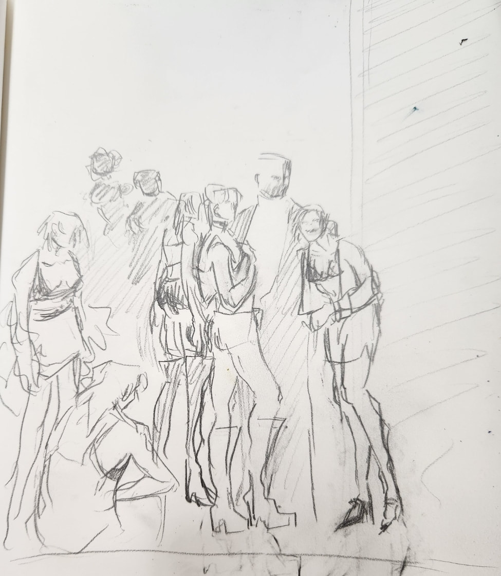
After finding the two pieces I wanted to recreate, I began working in my sketchbook. I had done many sketches, some being recreation sketches and some being very specific to the piece itself, like a page full of concept outfits for the girls in Industry, having taken inspiration from photography done of sex workers in the 80's and 90's, and a page full of drawings mimicing Toulouse-Lautrec's style. For both pieces I tried to get one sketch of the original painting, and another of the recreation. While practicing, I used many different mediums to do so, such as gauche, oil pastels and crayons, as I wanted to expand the mediums I use in my work. After choosing Henri de Toulouse-Lautrec's poster work to use as the style however, I decided the provided gouache paint would be the best medium to use, as Toulouse-Lautrec's style doesn't have much traditional shading, but instead harsh solid colors with blacked out figures to create depth and shadows. Additionally, the way some elements in his work has a watercolor art style to it with colors layered on top of each other to create subtle textures is a technique that would be best achieved through the watercolor paint. After my decision, I still used the crayons to practice layering colors as not to use too much of the gauche on things that weren't my final painting. |


Photographer Katsu Naito

Photographer Katsu Naito
|
|


Photographer Leon Levinstein
|

When drawing practices for the paintings, I ran into a number of problems and anxieties. Both of the non-style reference paintings are very stylized in color, using lots of contrasting hues in their work to create layering and emphasis in their art. Toulouse-Lautrec's poster work does many of the same in his work but in a much technically different, minimized way. He uses layering in his work but very lightly so harsh texture doesn't appear on the canvas. He uses very harsh colors, but typically nothing past flat colors, to create contrast in the piece. The poster work is nearly the exact opposite than my references, however with my theme, I knew using Toulouse-Lautrec's work would only emphasis the meaning. My theme for my work is the relationship between American capitalism and the workers and how it affects those under it, and this specific piece is focusing on the sexual aspect of that topic. Because of the gendered social constructs people put upon others, with the strong, powerful male and the dainty, housewife woman, violence against women often becomes fetishized, especially in the sex industry. One painting depicts a group of sex workers standing outside a building waiting for work, and the other shows one of those women battered and bruised at home. Both of these are packaged together in a poster art style, an art style used by businesses to advertise their services, for you to view. By using this style, it adds an extra layer to the theme of my work, and so I decided against the prospect of finding a more intensely colored piece that would be similar to Nude and Opera in coloring.
I had completed Shelter first. To really lean into the poster art style, I outlined the final sketch in permanent black marker, erasing the pencil underneath when completed. From there, I painted the background first, often moving from place to place to allow the paint to dry, and go over it again to give it the soft layering effect Toulouse-Lautrec has in his work. Then I painted the blanket, and finished off the base painting with the hair. From there I completed the details, which was mainly the bruises on the woman's body. I used a combination of colors, using red, blue, purple green and yellow to create colorful bruises. While this element is a deviation from Toulouse-Lautrec's style, I believe the inspiration is still noticeable enough that it wouldn't affect the overall vision, and its an important contrast to the next painting so it needed to be included. I layered the colors on top of each other and used direct water to give it a faded look on some areas across the piece. Finally, I went over the piece with white gouache to remove any remaining sketch lines and created touch ups with the marker and paint where needed.

|

|

|

|
When painting Industry, I used much of the same format. I had begun with griding the board, and moving on to paint, touching up when I was finished and as I moved along the piece. However, unlike Shelter, a few unique problems popped up when working on the painting. For one, the very fluffy nature of the girls paintings in the original not only came off as stylish designs on the board, but also helped fill out the image. With this painting, since all of the girls clothes are changed, I didn't have that element at all. This became most prominent with the girl in the front of the painting, and I had a hard time adapting this pose to my recreation. Since the beginning, I had one character with fluffy shoulder wear that I had placed to the far end of the piece, believing it would fill out his pose more. However, the girl on the bottom would've benefited from this outfit a lot more, so I switched the designs. Another problem was the back of the piece. Again, I found it hard to adapt the people in the background area to Toulouse-Lautrec's artstyle, and had initially decided to just darken the entire area to give the piece contrast. However, after discovering Ambassadeurs: Aristide Bruant Dans Son Cabaret, I realized that this stylish technique was exactly what I was looking for, and last minute changed the decision. I believe this really helped the piece a lot in the end, and made it pop more.

Closeup on INDUSTRY
|

Closeup on INDUSTRY Sketch
|

Closeup on Ambassadeurs: Aristide Bruant Dans Son Cabaret
|

Closeup on INDUSTRY
|

|

|

|
Experimentation
As stated before, I want to use many different mediums during this course and experiment a lot when creating artwork. Because of this, when given the gouache, I wanted to see if there was any other supply that may fit the piece more, and since I didn't want to use all the limited paint, I thought that practicing with the mediums early on in the process would be the best route to experiment. In my sketchbook, I used crayons and oil pastels to get a feel for the supplies while working.

Crayon sketches for INDUSTRY
|

Crayon sketch for INDUSTRY
|
The crayon was the first material I used. When using it, it came off in a very thick, chalky way. I needed to use a lot of the crayon to get it fully across the paper, which became hard to control at times with how large the tip of it was while working on a small surface area. Blending the crayon was something I had ambivalent feelings for; in the second and third sketch for Shelter, I really liked the way the red and purple crayon blended into each other to create a magenta color. I would often use the purple in harsher tones to create shading across the red chair to give the furniture an almost worn feel to it. However, I didn't like how the medium itself would create a crumbly texture on the paper that would only become exemplified if you were to layer multiple colors. I do wonder how the texture of the crayon would work on different types of paper with different surfaces though. Despite the downsides however, the crayon was great for small, sketchy drawings to play with potential color pallets and hues. Though I don't think I'll every use crayon as the main medium for a piece, I wouldn't mind using it during the process of another artwork.

Oil pastel sketch for SHELTER
|

Crayon sketches for SHELTER
|
 Closeup on oil pastel shading practice for SHELTER
The second medium I experimented with was oil pastels. I was excited to work with these material as I've always loved pastels, even as a child. I was also excited to see how the material would compare to the crayon, as they are very similar in shape and feel. I believed that oil pastels were almost like a smoother, softer version of the crayon. I still agree with this sentiment, however I believe this statement is more nuanced than I initially believed after working with them back to back. Like the crayon, I had to use a lot of the material to get it across the paper, and especially to shade. This became a problem because of how small the oil pastels are, and I often had the fear of running out of the medium before I even finished getting it across the page. Also, while it came off smoother than the chalky crayon, and I personally like the look of the oil pastels more than the other medium, it was much harder to work with than the crayon, almost feeling like I was coloring on wax. This was to be expected of course, however I realized that getting specific colors I was able to achieve through the crayon wouldn't be possible with the oil pastels. The magenta red and purple hue I liked wouldn't have been easily created through the pastels, and nor layering thick, contrasting colors, coming off as streaky when attempted. Blending with pastels is possible, though it requires much more work, especially if I wanted to get similar hues found in Toulouse-Lautrec's work. Because of these factors, having to use so much for the material and how difficult it would be shading in such tiny areas that frankly was not worth it for a practice piece, I only used the pastels for Shelter. Despite this though, I am interested in working with the medium again. This experience was very valuable to me as I do want to use oil pastels for an art work in the future. This was a great preface to that future piece, and to getting into pastels again.
Critique


La Troupe de Mademoiselle Eglantine
|

|


|

|
Compare
Between all three inspirations and my final piece, there are many comparisons to be made between them. The most obvious one is the poses and style in the works itself. Even without looking directly at the references and just keeping them in mind, it's very clear what they're referencing. Another comparison is the painting technique in the works. Toulouse-Lautrec has a very specific watercolor technique where he doesn't try to clean up patches of unevenness in his work, but instead keeps them and even leans into them. This gives them a very specific, and interesting feel that I also tried to achieve in my work. Additionally, as stated before, the background people blacked out and behind a purple, blueish tone mimics the same effect done in Toulouse-Lautrec's painting Ambassadeurs: Aristide Bruant Dans Son Cabaret.

|

|

|
(From left to right) Close ups on a corner of Seated Nude, La Troupe de Mademoiselle Eglantine, and Shelter
Contrast
From the pose inspiration pieces, the pallets between the two are entirely different. Through Toulouse-Lautrec's style, the colors are now very consistent and toned down. There aren't thick, overlapping contrasts of color, but are now changed to smaller, punchier pops of color. Additionally, certain elements were added to fit Toulouse-Lautrec's style that wasn't just the color, like the titles on each piece to mimic an advertisement. Finally, the structure of the pieces are different. In both Shelter and Industry, the people in both were both minimized to fit the poster style. I believed that this would've been the best route when making the pieces, but reflecting on the process, I feel like if I wanted too I could've kept the original dimensions, and honestly might've helped Industry if I did.
Reflection
All in all, I have complicated feelings with this project. It didn't turn out how I imagined it much at all, especially Industry. I feel like with this prompt, I could've done more. While the poses are reminiscent, they are not perfect at all, and I wish I did prior work with studying Henri de Toulouse-Lautrec's style, I feel like I could've improved it much more if I did. Toulouse-Lautrec has a certain fluidity to his work that I just did not achieve in Industry. I feel really disappointed because I don't feel like this showcased my artistic abilities, and I had a lot of excitement to work on this, but once I noticed the cracks were forming and far too late to change it, I lost a lot of motivation for the piece. Although, it wasn't all bad. I liked doing the pre-planning, the sketching and drawing and discovering what the piece was going to be about. And I do enjoy the way the colors look on the canvas, it worked out really well and they look very similar to Toulouse-Lautrec's pallet, even if I do wish I was able to utilize that more. And, out of the two paintings, I do feel more proud of Shelter, most of my problems coming from Industry. Through all of this, I think this has really shown me how important planning is. How sketching and thinking forward can make or break a piece. There are so many things I can think of now that would've really improved this work.
ACT
Clearly explain how you are able to identify the cause effect relationship between your inspiration and its effect on your artwork?
All inspirations for this piece were very clear in its production. The characters in the pieces are very clearly based off of the inspiration, and the coloring of the pieces, from the vibrant hues contrasted against the deep blacks of the background in the shadows and the watercolor painting, Henri de Toulouse-Lautrec's influence is very clearly there.
What is the overall approach the author has regarding the topic of your inspiration?
Personally, I believe that these artists would like what I did with their art, and how it influenced me. Like Georges Braque I experimented with different mediums, I painted a politically charged message like Jean Louis Forian, and I was inspired by my environment much like Henri de Toulouse-Lautrec's, even using similar subjects of sex workers and viewing them in humanizing ways much like he did in his works.
What kind of generalizations and conclusions have you discovered about people, ideas, culture, etc. while you researched your inspiration?
I came to understand how connected the art world is. It was genuinely interesting to read about different artists who knew and liked each other paintings, it completely surprised me. To learn that my two artists Forian and Braque were friends in real life and were fans of each other was very sweet and a nice reminder that art is a community.
What is the central idea or theme around your inspirational research?
How the art community can affect one's work. Through my research, I've seen all three of these artists go through changes and adapt as the art sphere does too.
What kind of inferences did you make while reading your research?
The different era's of art will shift and change and develop forever but there will always be through lines connecting creatives to one another.
Bibliography
Jean-LouisForain.com. Jean-Louis Forain (1852-1931), Jean-LouisForain.com, jeanlouisforain.com/en/#:~:text=After%20regaining%20his%20faith%20on,his%20several%20pilgrimages%20to%20Lourdes. Accessed 14 Dec. 2023.
Christies.com. The posters and lithographs of Henri de Toulouse-Lautrec, Christies.com, https://www.christies.com/en/stories/collecting-guide-the-posters-of-henri-de-toulouse-lautrec-c6bb45e59ca34abdb61072eea4d6b695. Accessed 14 Dec. 2023.
McMullen, Roy D. Georges Braque, Britannica, https://www.britannica.com/biography/Georges-Braque. Accessed 14 Dec. 2023.
